Kuka Cosmetics
Kuka Cosmetics
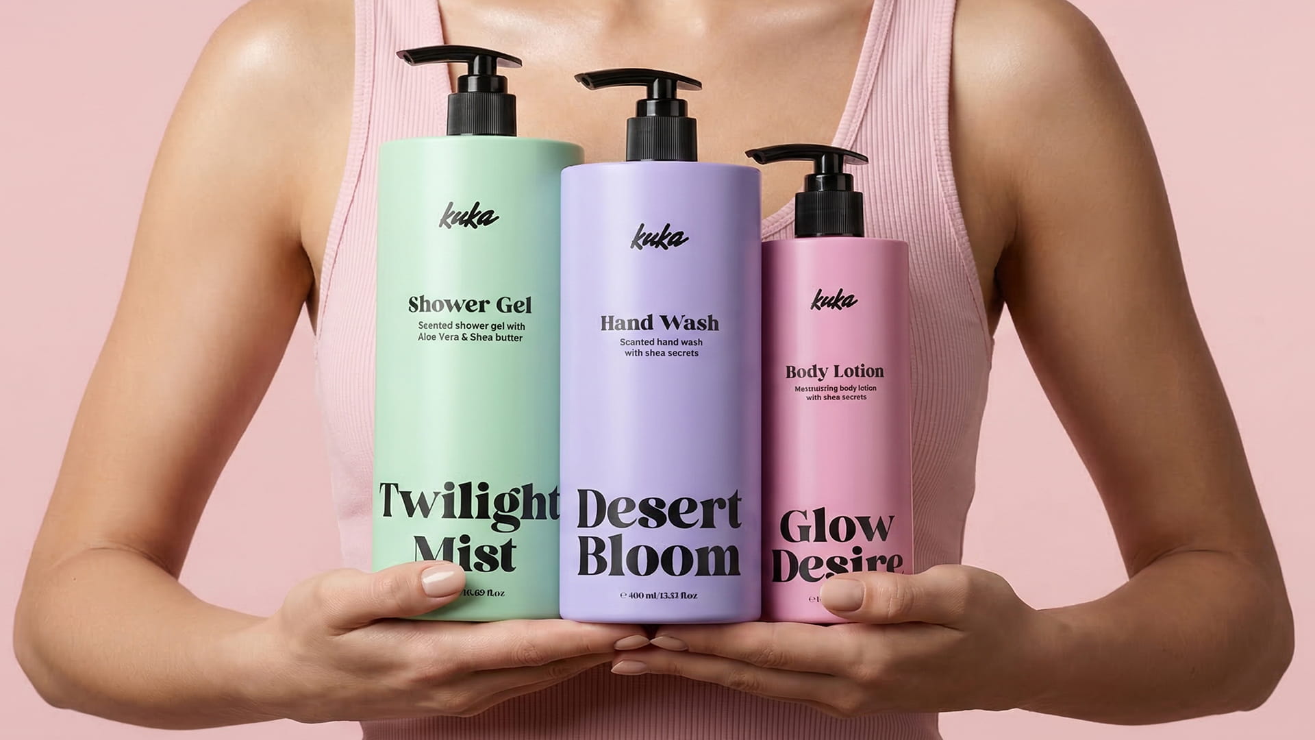
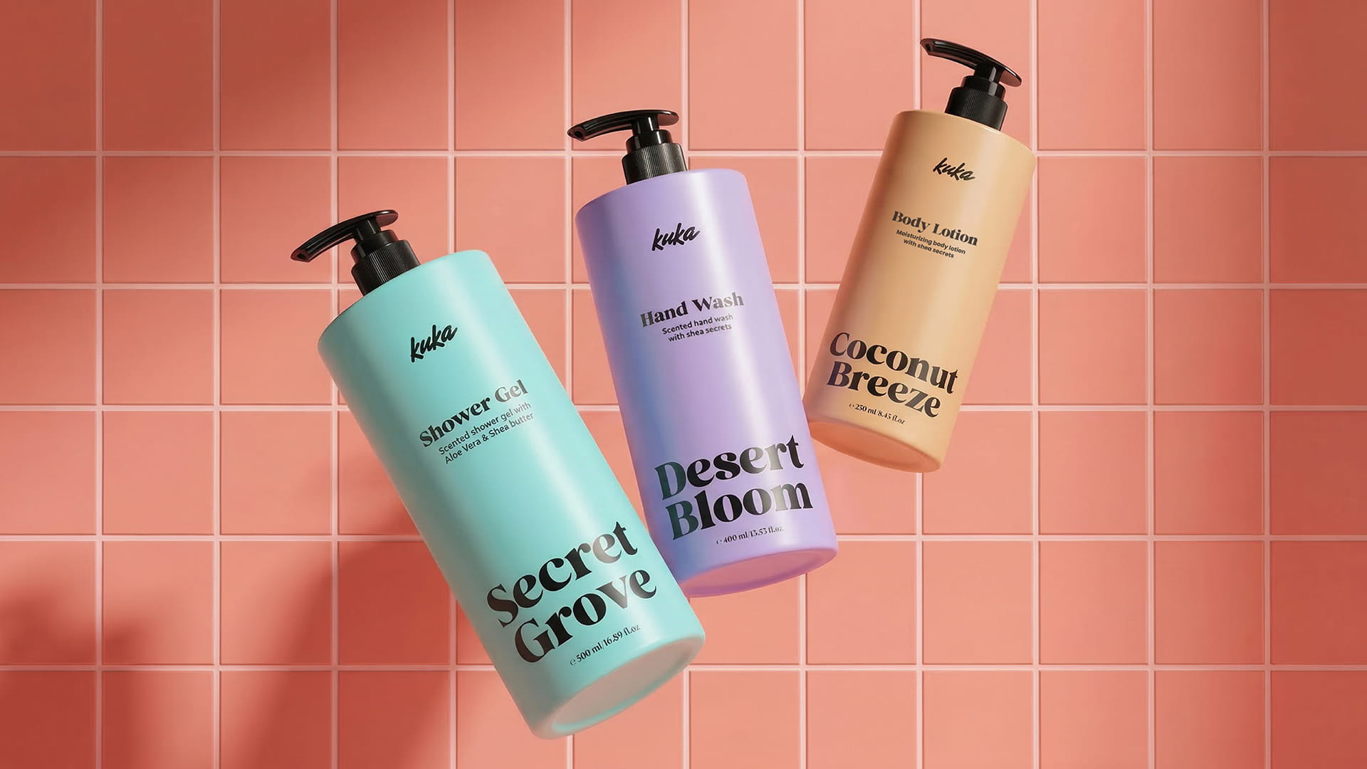
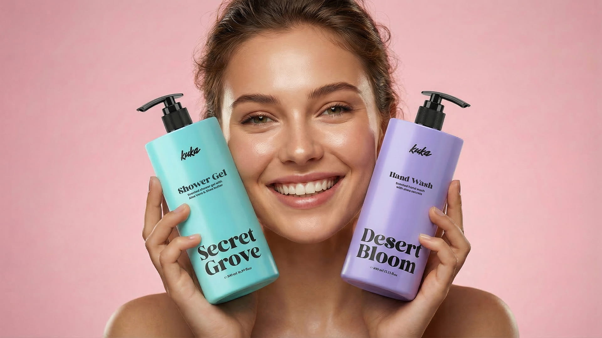
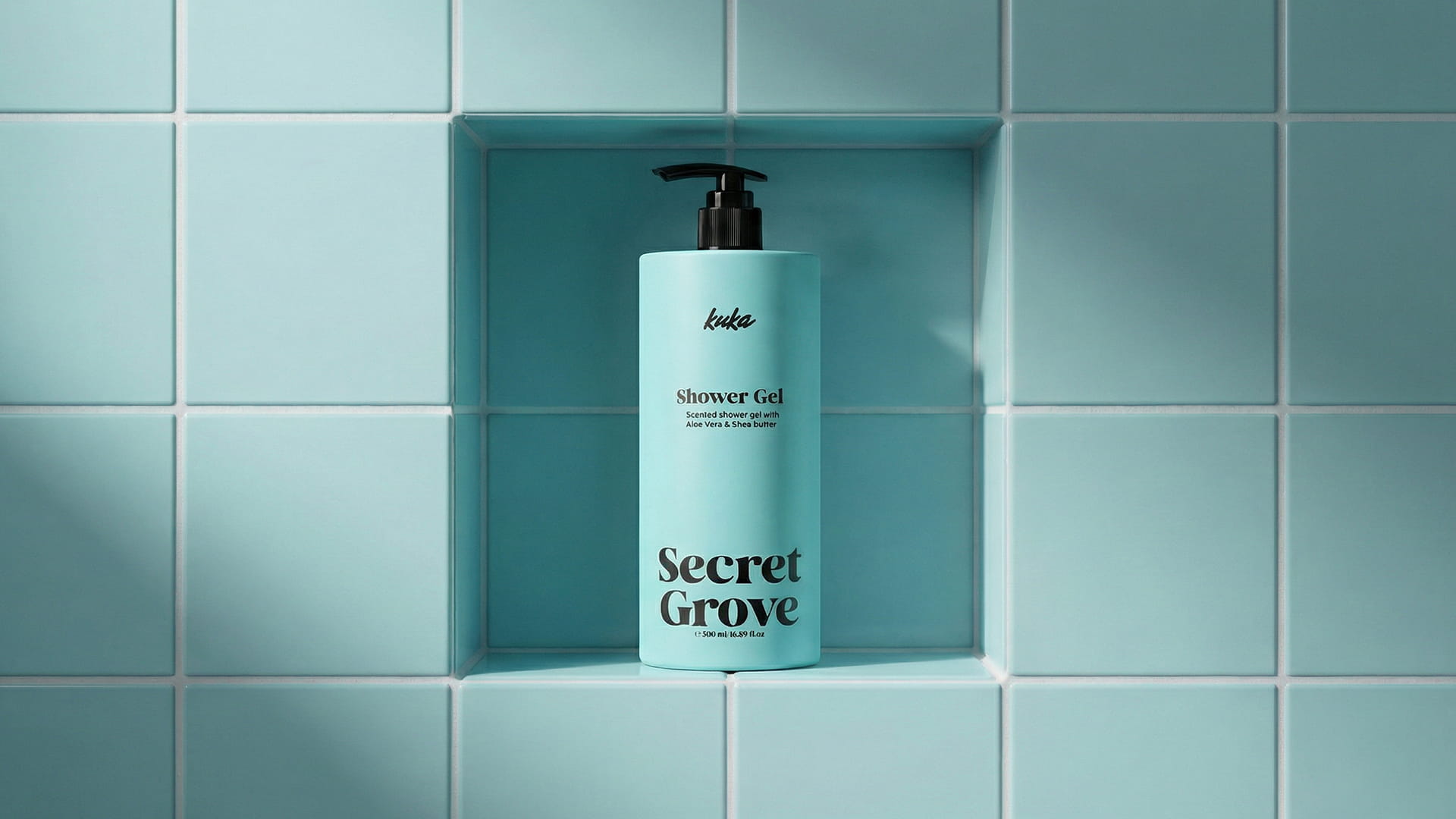
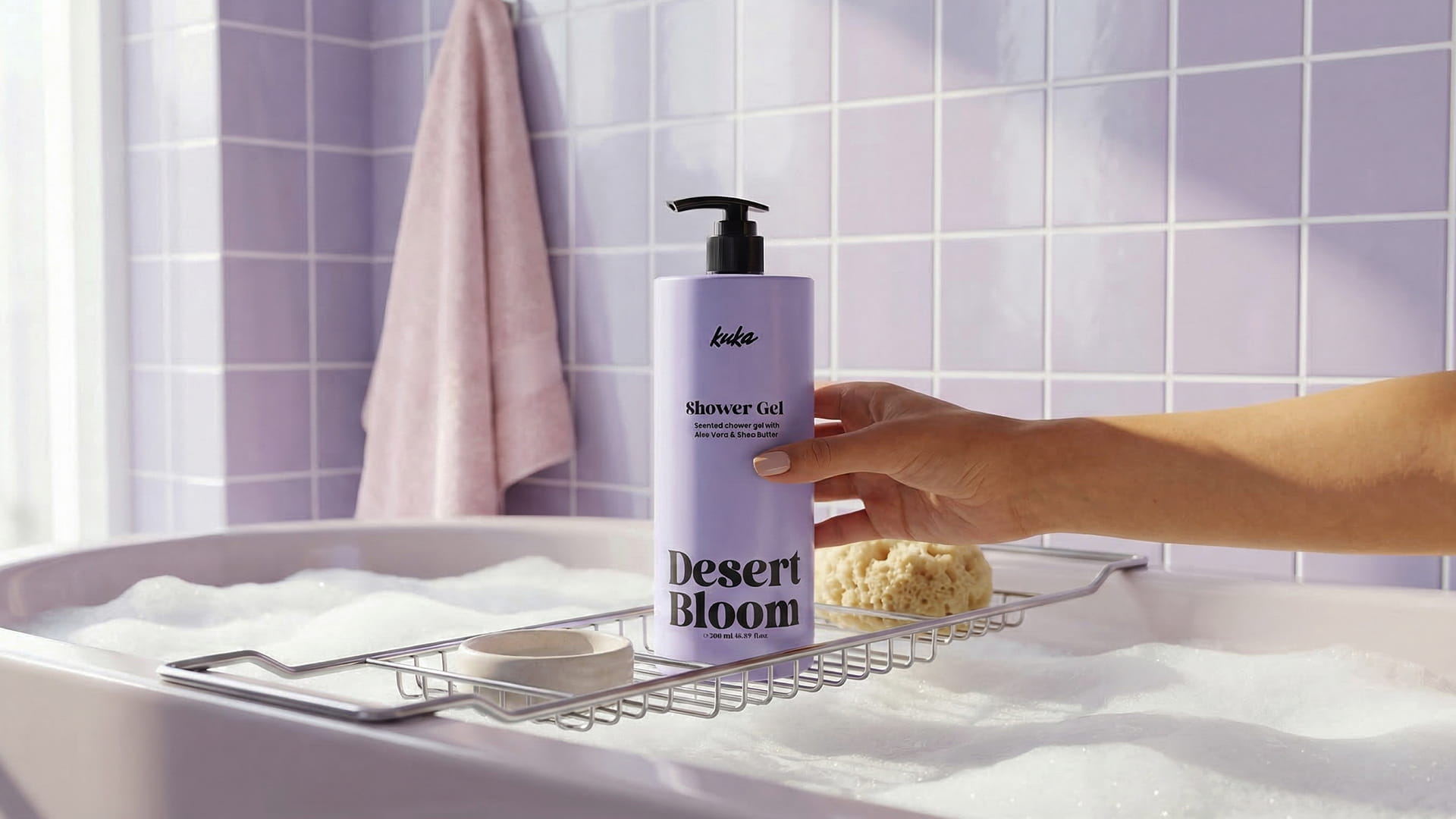
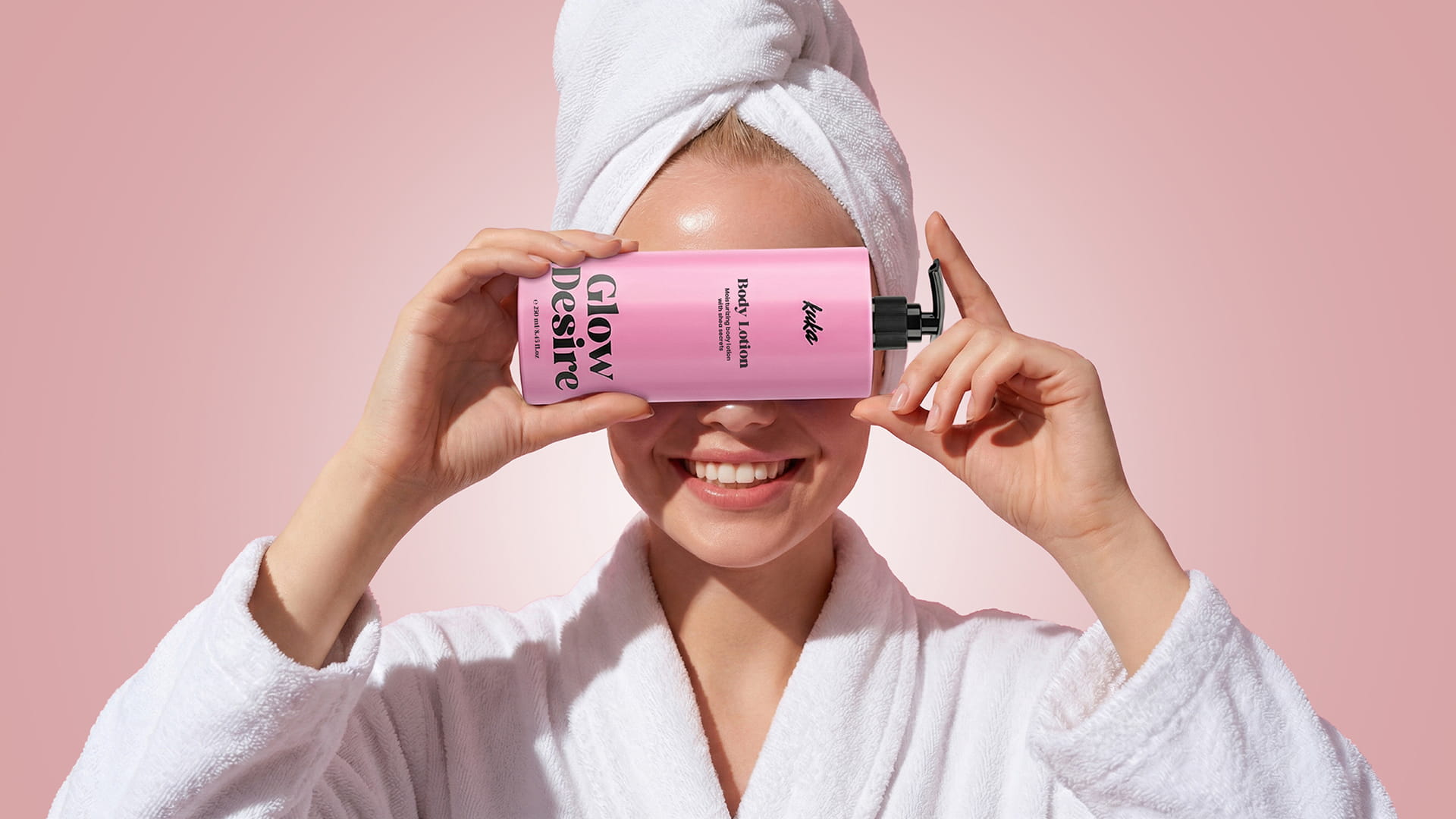
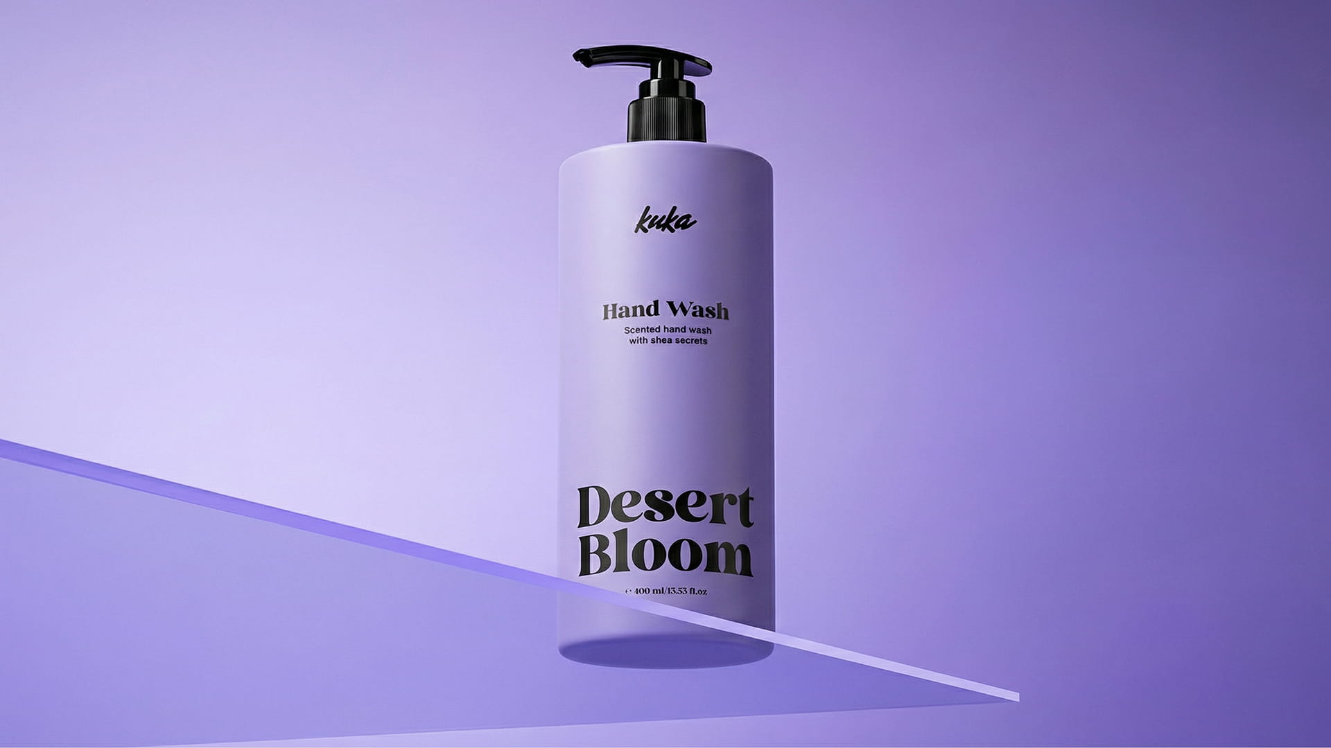
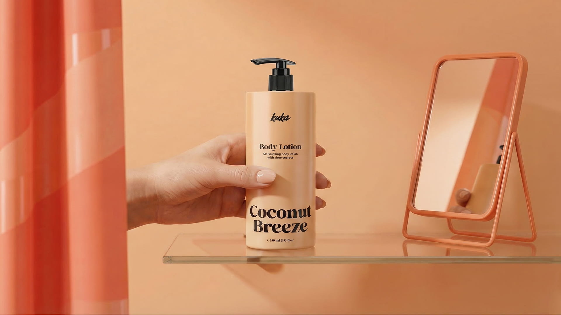
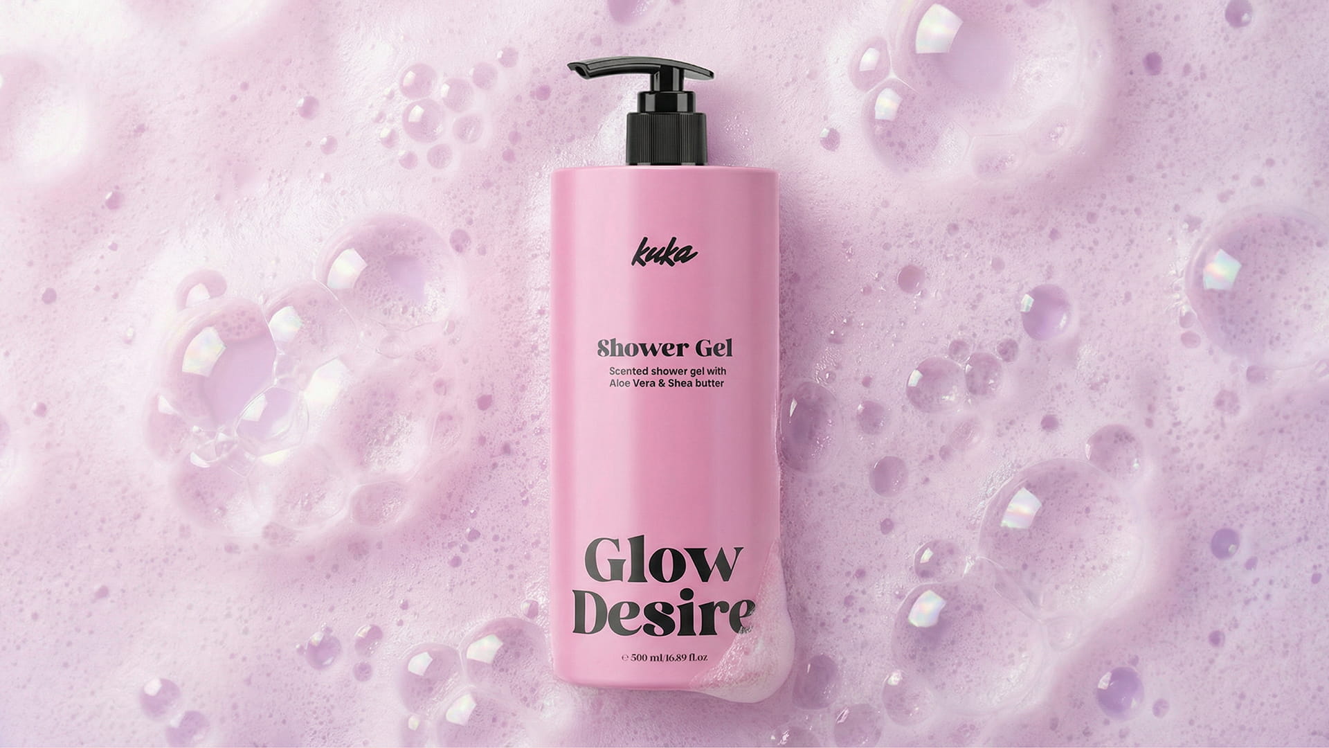
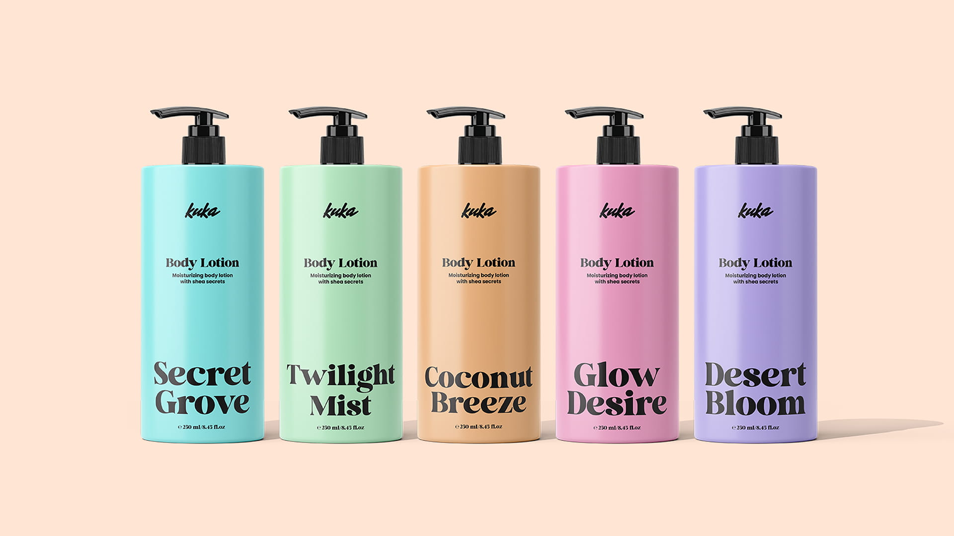
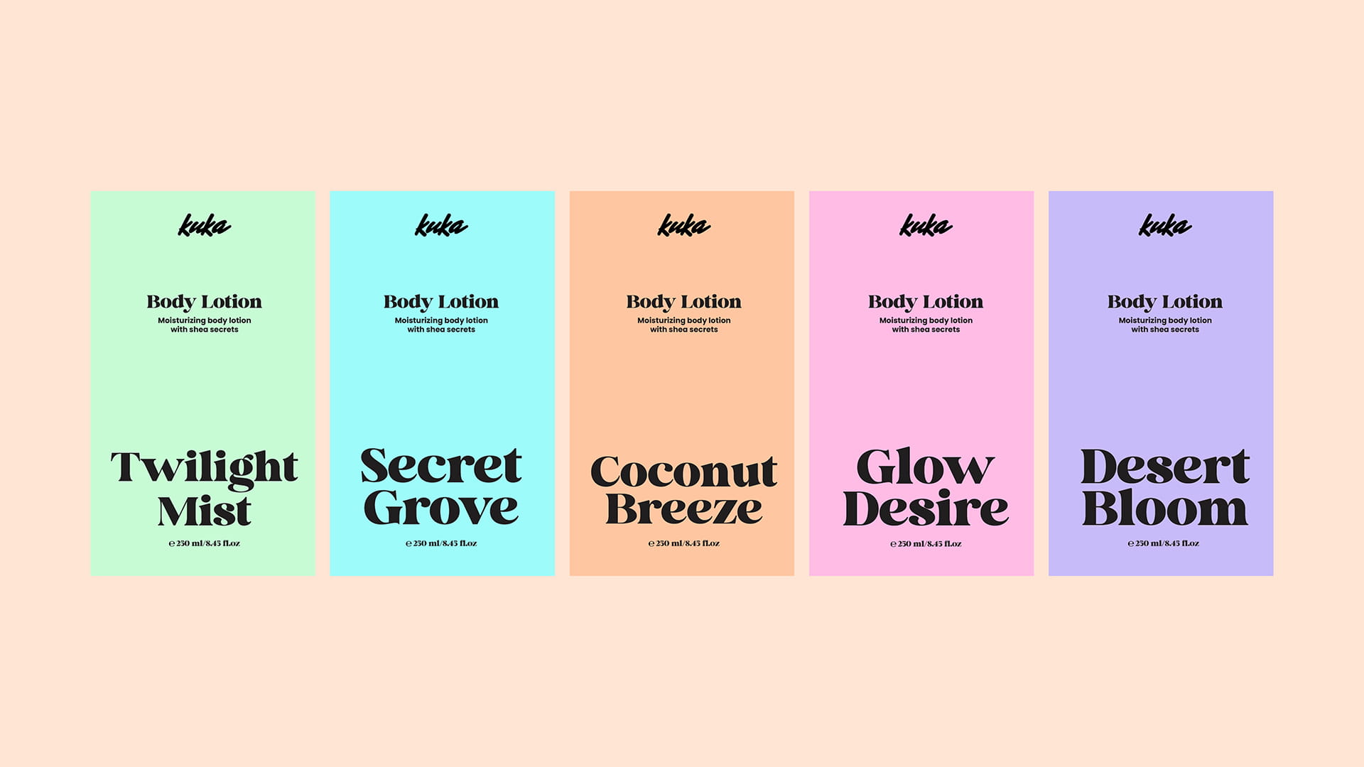
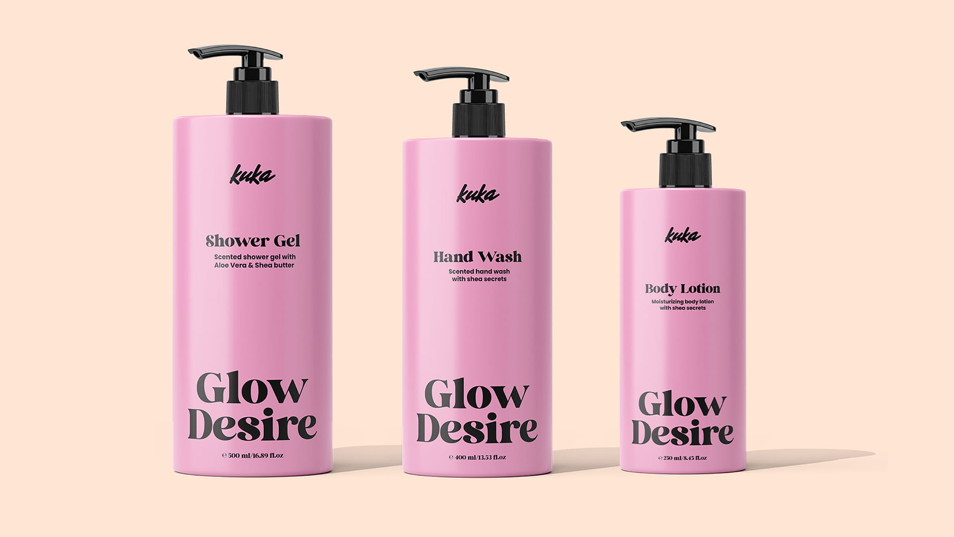
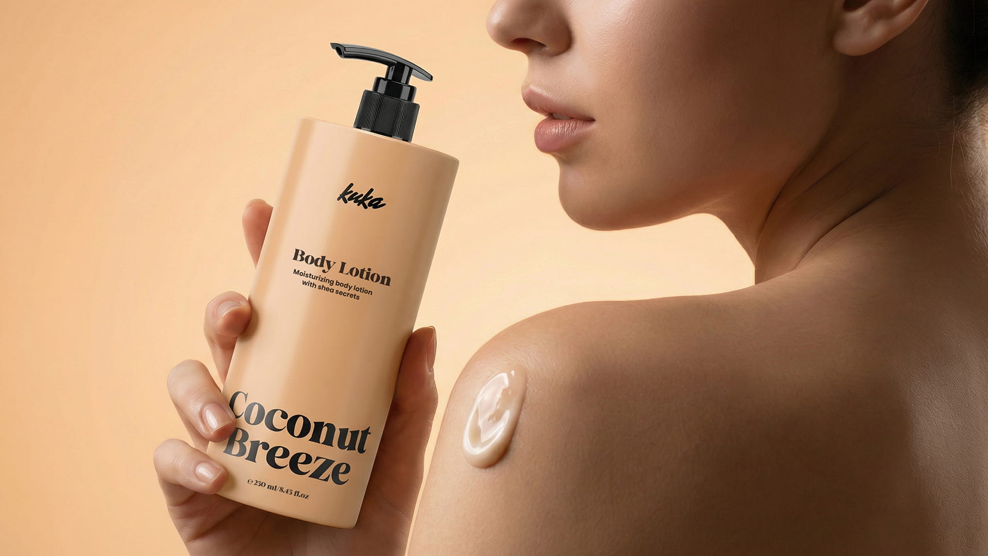
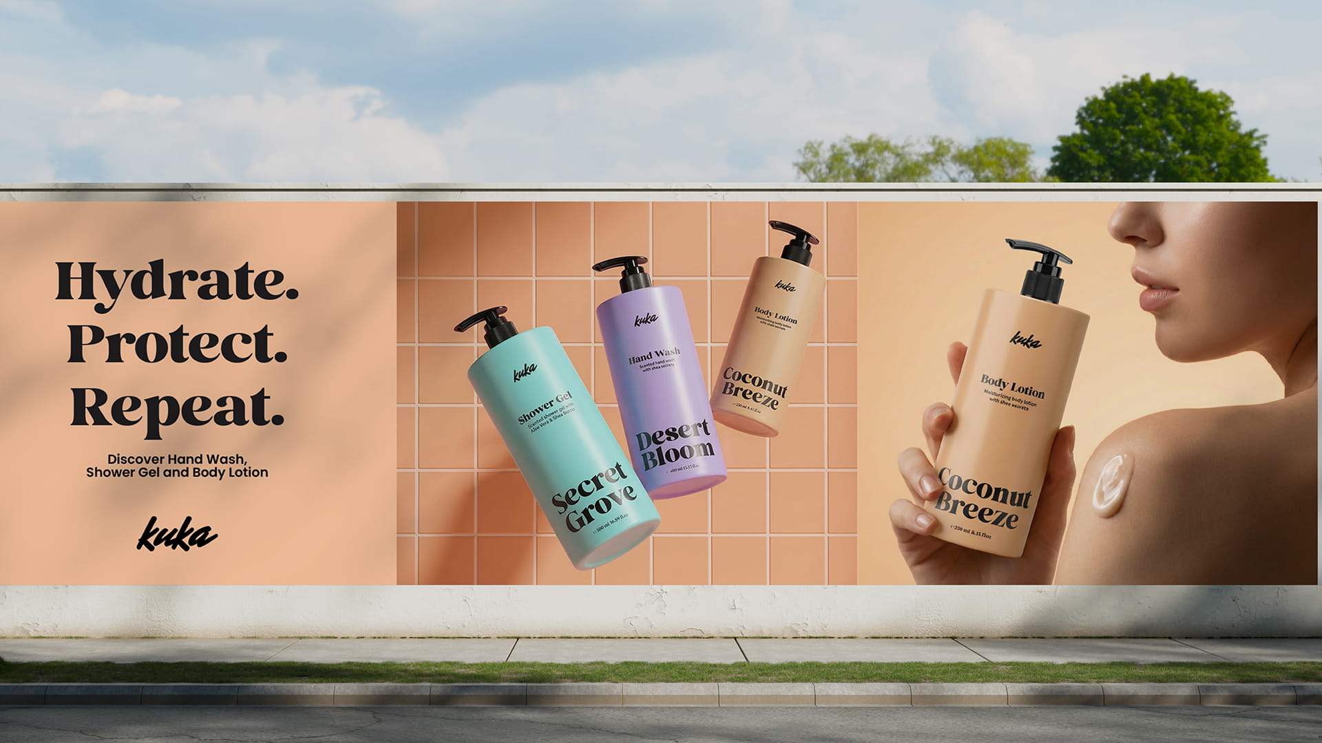
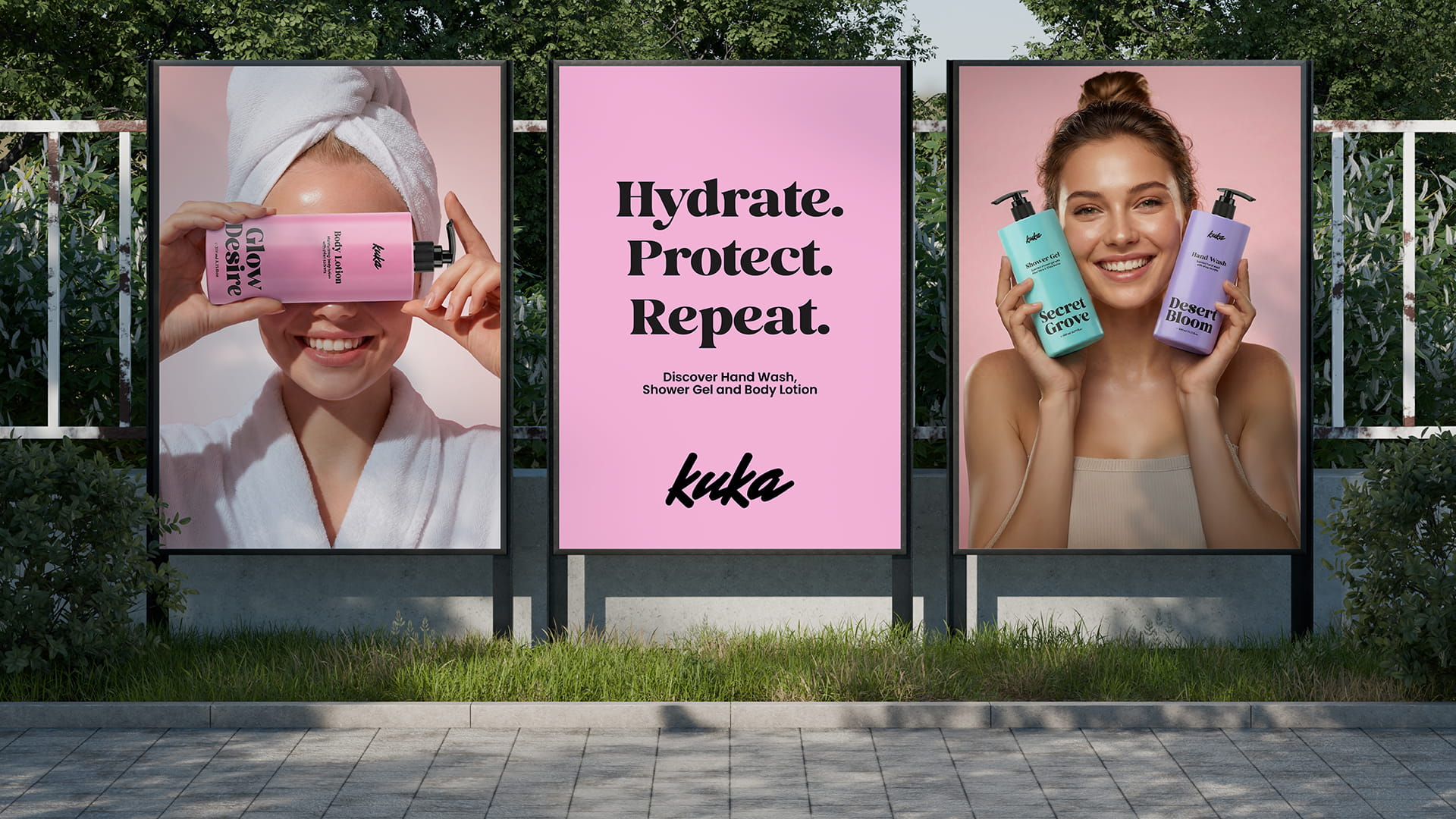
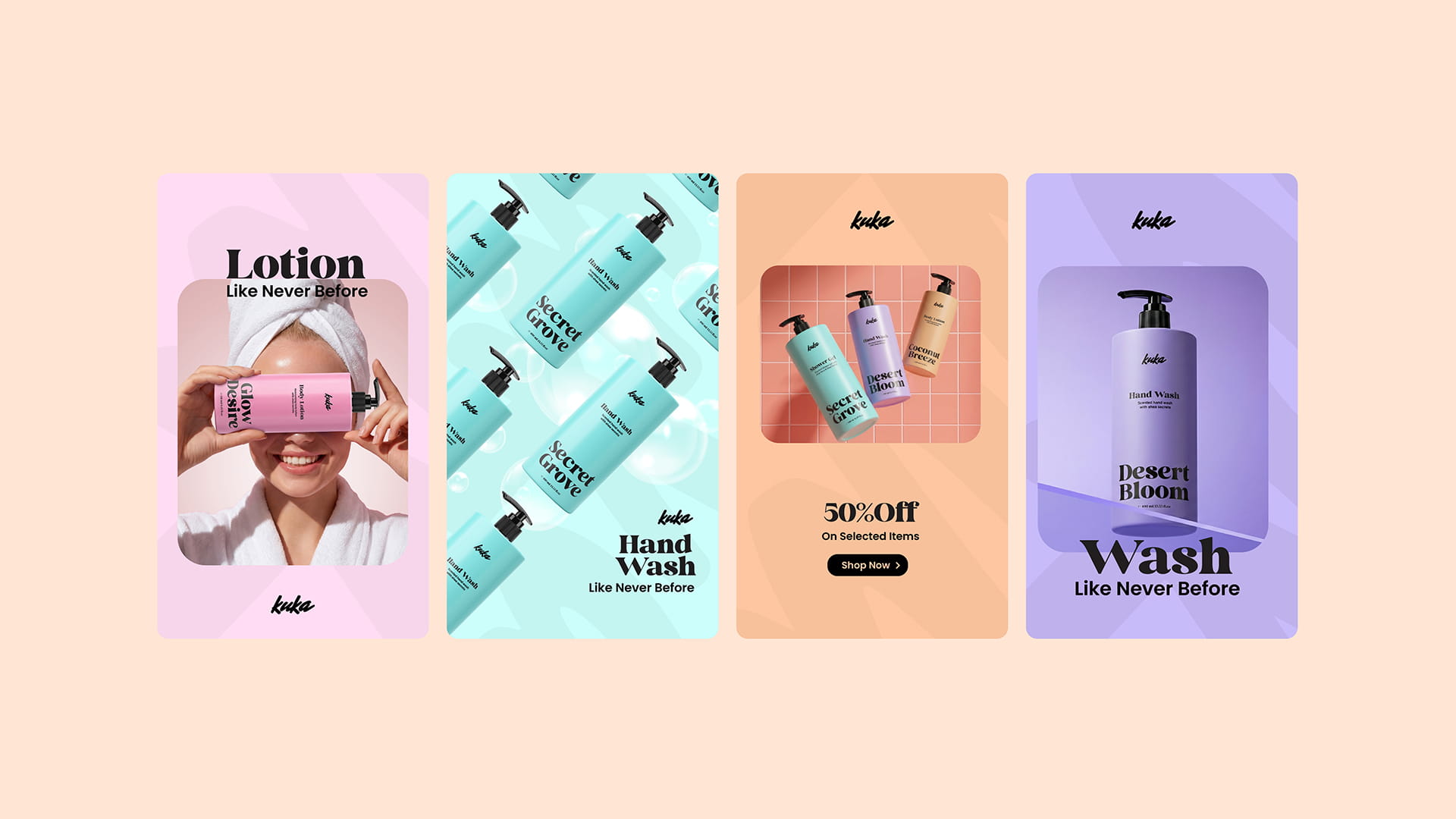
The visual identity and packaging system for Kuka was developed to communicate clarity, freshness, and modern self-care. The design relies on a minimal typographic hierarchy, soft pastel color coding, and clean cylindrical packaging to create strong shelf recognition while differentiating each scent variant such as Secret Grove, Coconut Breeze, Glow Desire, Twilight Mist, and Desert Bloom. The visual language balances elegance with approachability: bold serif fragrance names provide character, while the restrained logo and simplified layout maintain a premium yet accessible aesthetic. Across body lotion, hand wash, and shower gel, the consistent bottle silhouette and color palette build a cohesive product family that feels contemporary, calm, and distinctly memorable in retail and campaign visuals.